Saturday, 25 September 2010
Week 10 Club? Art Gallery? Prison!
This week I read a piece of very interesting news---Norway Builds the World's Most Humane Prison. The writer is William Lee Adams, Times’ senior editor.
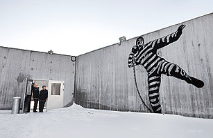
Look at the picture above the story! An inmate is dancing hip-hop... or singing a song , with a big smile…on the wall. However, that place is not a club or an Art Gallery. It is a new prison in Norway, which is regarded as the World's Most Humane Prison.
To make the article more attractive, the writer used anecdote as the beginning of the story. The sentence “this isn't cabaret night at Oslo's Royal Palace. It's a gala to inaugurate Halden Fengsel, Norway's newest prison” reflected the dramatic difference between Halden prison and other prisons worldwide. After that the writer introduced the location of the prison, its functions as well as its structures. Compared to American’ prisons, inmates in Halden prison can have cooking class and made delicious orange sorbet.
Furthermore, the writer went on to discuss the unique design of Halden prison in the next several paragraphs. As the writer described in his story, the exteriors of this prison “are not concrete but made of bricks, galvanized steel and larch”. The Halden prison seems to have grown organically from the woodlands. Besides, the writer was also good at utilizing quotes and comments to describe his agreement of this distinctive architecuture . For example, he cited Hans Henrik Hoilund, one of the prison's architects’ quotes "the most important thing is that the prison looks as much like the outside world as possible" to express designers’ intention, which was to avoid an institutional feel.
I think a large number of prisoners would want to live there….
What a humane prison!
Links: http://www.time.com/time/magazine/article/0,9171,1986002,00.html
Week 9 Alsop Architects’ Sharp Center
This article portrayed Alsop Architects’ Sharp Center’s unique design style. Alsop Architects’ Sharp Center, which located in Toronto, is regarded as one of the most recognizable structures in Toronto, Canada.
To make article more attractive, the writer described the reputation of the new centre at the first paragraph. As he portrayed, the new centre “provides 115,000sqft of new space for the country’s most prestigious art college in a landmark building designed to unify the existing site and accommodate a 50% increase in student numbers. It also forms a centerpiece for an already hip area just north of the commercial centre of Toronto.”
Then the writer presented the details of this building. In terms of its interior, the building has “a new three-storey Great Hall and a four-storey entrance lobby in the original brick building.” He also described its exterior as “a translucent rectangle on stilts, 26m above street level, with pods slung underneath it and light chimneys on top”. Moreover, the writer was also good at utilizing quotes and comments to describe his protagonist in the article. For instance, he cited Alsop’s quotes that The Sharp Center was “Slightly removed from the world.” in the second paragraph.
After that the writer described the function and structure of The Sharp Center. Finally, Kieran presented the tremendous changes that the building has brought to Toronto,which is “put Toronto on the contemporary architecture map”. The writer also used Jamie Wright, partner of Robbie Young & Wright’s quotes to state that Toronto need more contemporary architecture nowadays.
Links:http://www.iconeye.com/index.php?option=com_content&view=article&catid=332:icon 014&id=2708:ontario-college-of-art-and-design--icon-014--julyaugust-2004
Saturday, 11 September 2010
Week 8 Musashino Art University Library by Sou Fujimoto Architects
This is a plan of Musashino Art University Library by Sou Fujimoto Architects. This feature story is written by Rob Gregory on September 2010. The feature reflected the writer had a unique angle and advanced writing skills.
In the beginning of the story, in order to maintain the readers’ interest throughout the feature, instead of depicting details about the designers---- Sou Fujimoto Architects’ background, Rob compared the designer’s existing masterpieces to this new challenge. Moreover, he also told readers that Fujimoto’s ability to “produce a large-scale institutional building has remained untested, so anyone interested in the scalability of his talents will be particularly keen to scrutinise the plans for the recently completed Musashino Art University Library in Tokyo.” This can better grab the readers’ attention. Readers may get interest of Sou Fujimoto’s new challenge.
In the next paragraph, the writer portrayed Sou Fujimoto’s design, which was Sou Fujimoto “combines conceptual clarity with functional rigour to generate a new form of library planning.”Then Rob presented the process that Fujimoto won the project. The writher used others’ ideas in the beginning to render Piano’s distinctive design. Then Rob stated that it was Fujimoto’s ‘forest of books’ concept that made an impact on the jury” in the end.
After that Rob continued to introduce the details of the Musashino Art University Library. It was “based on a series of independent rectilinear book stacks, dispersed to create a field - or forest - of monolithic blocks”. As the writer described, the building was “vary in size, with some large enough to contain essential services and ancillary spaces, the blocks promoted what the architect described as ‘an instinct to wander’, recalling how in his experience libraries are places where readers are encouraged to ‘get lost’.
Then Rob varied the tone in the next several paragraphs, he pointed out that Sou Fujimoto’s design encountered some difficulties in the in the construction and the team had to reconsider some options. Then Rob portrayed the design details such as “timber predominates” “axial window” as well as “crescent-shaped void” to leave an intuitive impression to readers and make the article more professional and attractive.
Link:http://www.architectural-review.com/buildings/musashino-art-university-library-by-sou-fujimoto-architects-tokyo-japan/8606133.article
Thursday, 2 September 2010
Week7 2010 Pritzker Prize---Japanese got it!
The Pritzker Architecture Prize usually goes to just one architect. But this year, two Japanese partners are being honored. Kazuyo Sejima and Ryue Nishizawa, partners in the Japanese architectural firm Sanaa, have won the 2010 Pritzker Architecture Prize.
I read a lot of related news and their projects and want to understand what the personality of their architectures is.This is the jury’s citation. “They explore like few others the phenomenal properties of continuous space, lightness, transparency and materiality to create a subtle synthesis,”
I think the Japanese team’s architectures are deceptively simple. In all of their projects, I love this architecture best---Zollverein School of management and design
I think the Japanese team’s architectures are deceptively simple. In all of their projects, I love this architecture best.
The design, the oversized cube, which measures 35 meters by 35 meters and is 35 meters high. The building has four floors with ceilings of varying height as well as a roof garden. As the designer said,” the idea of stacking open floor plans was developed in compliance with the demands made by the various functions.”
Japanese’ design is usually have a simple exterior. However, its interior is a wide and complex space.
The ground floor has a multi-level presentation hall, exhibition and foyer areas for public use, and a café. On the second floor there is a Design Studio, which is a production level. The library is on the third floor together with open seminar rooms and several separate, quiet workplaces. The fourth floor is the office level, the working areas are divided by glass walls.
For my part, there is still a traditional Japanese architectural consciousness in this team, including simplicity, delicacy as well as space division.
Link http://www.nytimes.com/2010/03/29/arts/design/29pritzker.html
Subscribe to:
Posts (Atom)