Sunday, 17 October 2010

Week 12 The Issue of Form and Function


Last week I read a piece of news which was about MIT Stata Centre’s leaking problem. MIT Stata Centre, which is also called Drunk Robot Building, finished in 2004, but found there was leaking problem three years later.

The designer is Frank Gehry, one of the most notable architects in the world. He is also my favorite architect. However, in MIT’s case, he had to confront with a lot of accusations from others. The main issue is focus on the conflict between form and function when he designed MIT’s Stata Centre.

This week I read another piece of news written by Daniel Dessinger. Instead of giving the details of the leaking problems, he did an in-depth research of Gehry’s other existing masterpieces, As he described in the article, Frank Gehry “sacrificed function on the altar of Novelty.”

In the first several paragraphs of the article, Dessinger talked about Frank Gehry’s another problem that some of Gehry’s projects did not fit in with their surroundings. I partly agree with Dessinger’s opinion. However, I also do not want to see a host of ubiquitous square boxes which maybe perfect fit in with their surroundings.

But what I am focus is the form and function issue. The writer then gave a host of examples to criticize Gehry’s “free-form” style. For instance, one of Frank Gehry’s famous masterpieces---Walt Disney Concert Hall in LA “created hot spots on the surrounding pavement that at times climb up to 140 F, creating a health hazard for the pedestrians.”

The writer then concluded that “architecture should exist for and serve humans, not the other way around.”

For my part, Dessinger’s view is rather extreme. I want to say that a world where we pass by thousands of buildings noticing only a few, it is Gehry's work that seizes our attention. Of course he must look beyond form and focus more on a building's functionality. Anyway, Gehry's achievement in architectural realm is much bigger than some small errors he had made.

http://www.culturefeast.com/frank-gehry-and-fetishism-of-form/

Saturday, 9 October 2010

Week 11 Frank Gehry & MIT


Frank Gehry , who designed the Guggenheim Museum in Bilbao, Spain, is also the 1989 Pritzker Prize owner and one of the most notable architects in the world. He is famous for his deconstructive design and also regarded as the representative of post modernism.

However, when he finished one of his masterpieces ---The Massachusetts Institute of Technology’s Stata Center, Gehry was suing alleging serious flaws in the design.

It really surprised me; I have always admired his design. Thus I can not wait to read through the news. MIT’s Stata Center is a science building of boldly angled walls and swooping curves on the Cambridge, Mass. campus. The problems of the building, as the writer described in the second paragraph, included leaks throughout the building, mold growing on its brick exterior, and poor drainage in the center's amphitheater. Oh god…

I really like Frank Gehry’s unique deconstructive design, especially his buildings’ conspicuous exterior and materials. I also know he has many opponents. In the third paragraph, the writer went on to talk about some of his opponents’ opinion in relation to MIT’s problem. They criticized that Gehry cared more about the architecture’s form than function. They said that Gehry’s vision surpassed both the technology available to build what he drew and the size of his clients’ bank accounts.

The news was very attractive and I can not wait read Gehry’s response in the next several paragraphs. Gehry stated that “These things are complicated, and they involved a lot of people, and you never quite know where they went wrong”.

Fortunately, in the next several paragraphs, after a heated debate between MIT and Gehry’s company, the lawsuit was finally "amicably resolved." However, after reading this news, there is one thing confused me: the issues between form and function.

http://featuresblogs.chicagotribune.com/theskyline/2010/04/three-years-after-suing-gehry-mit-settles-with-architect-in-stata-center-dispute-.html

Saturday, 25 September 2010

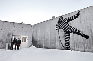
Week 10 Club? Art Gallery? Prison!


This week I read a piece of very interesting news---Norway Builds the World's Most Humane Prison. The writer is William Lee Adams, Times’ senior editor.

Look at the picture above the story! An inmate is dancing hip-hop... or singing a song , with a big smile…on the wall. However, that place is not a club or an Art Gallery. It is a new prison in Norway, which is regarded as the World's Most Humane Prison.

To make the article more attractive, the writer used anecdote as the beginning of the story. The sentence “this isn't cabaret night at Oslo's Royal Palace. It's a gala to inaugurate Halden Fengsel, Norway's newest prison” reflected the dramatic difference between Halden prison and other prisons worldwide. After that the writer introduced the location of the prison, its functions as well as its structures. Compared to American’ prisons, inmates in Halden prison can have cooking class and made delicious orange sorbet.

Furthermore, the writer went on to discuss the unique design of Halden prison in the next several paragraphs. As the writer described in his story, the exteriors of this prison “are not concrete but made of bricks, galvanized steel and larch”. The Halden prison seems to have grown organically from the woodlands. Besides, the writer was also good at utilizing quotes and comments to describe his agreement of this distinctive architecuture . For example, he cited Hans Henrik Hoilund, one of the prison's architects’ quotes "the most important thing is that the prison looks as much like the outside world as possible" to express designers’ intention, which was to avoid an institutional feel.

I think a large number of prisoners would want to live there….
What a humane prison!


Links: http://www.time.com/time/magazine/article/0,9171,1986002,00.html

Week 9 Alsop Architects’ Sharp Center


This article portrayed Alsop Architects’ Sharp Center’s unique design style. Alsop Architects’ Sharp Center, which located in Toronto, is regarded as one of the most recognizable structures in Toronto, Canada.

To make article more attractive, the writer described the reputation of the new centre at the first paragraph. As he portrayed, the new centre “provides 115,000sqft of new space for the country’s most prestigious art college in a landmark building designed to unify the existing site and accommodate a 50% increase in student numbers. It also forms a centerpiece for an already hip area just north of the commercial centre of Toronto.”

Then the writer presented the details of this building. In terms of its interior, the building has “a new three-storey Great Hall and a four-storey entrance lobby in the original brick building.” He also described its exterior as “a translucent rectangle on stilts, 26m above street level, with pods slung underneath it and light chimneys on top”. Moreover, the writer was also good at utilizing quotes and comments to describe his protagonist in the article. For instance, he cited Alsop’s quotes that The Sharp Center was “Slightly removed from the world.” in the second paragraph.

After that the writer described the function and structure of The Sharp Center. Finally, Kieran presented the tremendous changes that the building has brought to Toronto,which is “put Toronto on the contemporary architecture map”. The writer also used Jamie Wright, partner of Robbie Young & Wright’s quotes to state that Toronto need more contemporary architecture nowadays.

Links:http://www.iconeye.com/index.php?option=com_content&view=article&catid=332:icon 014&id=2708:ontario-college-of-art-and-design--icon-014--julyaugust-2004

Saturday, 11 September 2010

Week 8 Musashino Art University Library by Sou Fujimoto Architects


This is a plan of Musashino Art University Library by Sou Fujimoto Architects. This feature story is written by Rob Gregory on September 2010. The feature reflected the writer had a unique angle and advanced writing skills.

In the beginning of the story, in order to maintain the readers’ interest throughout the feature, instead of depicting details about the designers---- Sou Fujimoto Architects’ background, Rob compared the designer’s existing masterpieces to this new challenge. Moreover, he also told readers that Fujimoto’s ability to “produce a large-scale institutional building has remained untested, so anyone interested in the scalability of his talents will be particularly keen to scrutinise the plans for the recently completed Musashino Art University Library in Tokyo.” This can better grab the readers’ attention. Readers may get interest of Sou Fujimoto’s new challenge.

In the next paragraph, the writer portrayed Sou Fujimoto’s design, which was Sou Fujimoto “combines conceptual clarity with functional rigour to generate a new form of library planning.”Then Rob presented the process that Fujimoto won the project. The writher used others’ ideas in the beginning to render Piano’s distinctive design. Then Rob stated that it was Fujimoto’s ‘forest of books’ concept that made an impact on the jury” in the end.

After that Rob continued to introduce the details of the Musashino Art University Library. It was “based on a series of independent rectilinear book stacks, dispersed to create a field - or forest - of monolithic blocks”. As the writer described, the building was “vary in size, with some large enough to contain essential services and ancillary spaces, the blocks promoted what the architect described as ‘an instinct to wander’, recalling how in his experience libraries are places where readers are encouraged to ‘get lost’.

Then Rob varied the tone in the next several paragraphs, he pointed out that Sou Fujimoto’s design encountered some difficulties in the in the construction and the team had to reconsider some options. Then Rob portrayed the design details such as “timber predominates” “axial window” as well as “crescent-shaped void” to leave an intuitive impression to readers and make the article more professional and attractive.

Link:http://www.architectural-review.com/buildings/musashino-art-university-library-by-sou-fujimoto-architects-tokyo-japan/8606133.article

Thursday, 2 September 2010

Week7 2010 Pritzker Prize---Japanese got it!


The Pritzker Architecture Prize usually goes to just one architect. But this year, two Japanese partners are being honored. Kazuyo Sejima and Ryue Nishizawa, partners in the Japanese architectural firm Sanaa, have won the 2010 Pritzker Architecture Prize.

I read a lot of related news and their projects and want to understand what the personality of their architectures is.This is the jury’s citation. “They explore like few others the phenomenal properties of continuous space, lightness, transparency and materiality to create a subtle synthesis,”

I think the Japanese team’s architectures are deceptively simple. In all of their projects, I love this architecture best---Zollverein School of management and design

I think the Japanese team’s architectures are deceptively simple. In all of their projects, I love this architecture best.

The design, the oversized cube, which measures 35 meters by 35 meters and is 35 meters high. The building has four floors with ceilings of varying height as well as a roof garden. As the designer said,” the idea of stacking open floor plans was developed in compliance with the demands made by the various functions.”

Japanese’ design is usually have a simple exterior. However, its interior is a wide and complex space.

The ground floor has a multi-level presentation hall, exhibition and foyer areas for public use, and a café. On the second floor there is a Design Studio, which is a production level. The library is on the third floor together with open seminar rooms and several separate, quiet workplaces. The fourth floor is the office level, the working areas are divided by glass walls.

For my part, there is still a traditional Japanese architectural consciousness in this team, including simplicity, delicacy as well as space division.

Link http://www.nytimes.com/2010/03/29/arts/design/29pritzker.html

Monday, 30 August 2010

Thursday, 26 August 2010

Week 6 Another article written by Richard ---Thom Mayne's 41 Cooper Square


This is also an article written by Richard Lacayo. Compared to Ando’s article that I read in week5, Richard used a different writing method to portray Thom Mayne’s masterpiece-----Cooper building. Firstly, he described the surrounding before 41 Cooper Union set up. Readers may wander to know what architecture can fit in such a circumstance. Then the writer illustrated the exterior and interior of this building and Thom Mayne’s background. Compared to Week 5 ---Ando’s article, Richard’s description of this article is more concentrated on building’s details and structures instead of more subjective admiration.

In terms of Cooper Union’s exterior, for instance, he wrote Cooper Union building’s outside, which is “a perforated steel scrim that acts as both a sunscreen and an instant attention-grabber.” Besides, it’s inside, with “a perforated steel scrim that acts as both a sunscreen and an instant attention-grabber”.

Moreover, the week5 article was more general to portray the achievement of Ando, in this article; Richard took Cooper Union as a case study with more analysis. As a result of the plenty of facts, Richard can obtain a wide range of viewpoints and perspectives and his articles had more rich contents.

Besides, Richard cited Mayne’s quotes, “as a design and engineering school, Cooper Union is a place that's about creative capital. So we wanted something that had energy”, to explain the intention of Cooper Union’s complex orchestrations of space and perforated metal skin. Though Mayne’s quotes, readers can better understand the cause of Cooper Union’s exterior design and background.

At last, Richard also used Mayne’s comments to explain interior design. Mayne described the stairway as a vertical piazza and it was not just movement up and down but also a place used for gathering and sitting. He also related it to the age of Renaissance and the Spanish Steps, which left a more mysterious and historic impression to readers.

Link: http://www.time.com/time/arts/article/0,8599,1948643,00.html

Wednesday, 18 August 2010

Week 5 Ando's Elegant Simplicity


This is a small feature article for Ando, who is one of the most famous architects worldwide. The author is Richard Lacayo, Time’s senior critical writer. He is a professional writer in architecture and design.

In Ando’s story, the author compared the different architecture characters between Gehry and Ando .Then he use several of Ando’s masterpiece such as Church of the Light and Stone Hill Center, to further depict Ando’s architecture style and achievement. In his article, Ando’s masterpieces call “to mind the delicacy and simplicity of traditional Japanese architecture”.

Moreover, Richard’s collected a host of facts such as “Ando's Church of the Light” and “the Modern Art Museum of Fort Worth” and portrayed the materials, symbolic as well as structures. This may gave rise to more conviction and intuition to readers.

Besides, Richard cited Mark Twain’s evaluation to rural England, which was “too absolutely beautiful to be left out of doors”, to describe Ando’s Stone Hill Center. This architecture, as Richard depicted in his article, broke the boundaries of space and set up the elegant interactions with nature. Hence, the narration of Mark Twain left a more lyric impression of this article.

However, Richard did not use any quotes in Ando’s article. There are no Ando’s direct quotes and other architects’ comments. This may lack of facts basis and objective opinions to some extent. However, as a general and summary article it can be accepted.

Link: http://www.time.com/time/magazine/article/0,9171,1816490,00.html

Presentation PPT

Presentation PPT

Hi, everyone
This is my presentation on Slideshare.
http://www.slideshare.net/lilu0531/online-media-lulu-li

Welcome to discuss~

Lulu

Monday, 16 August 2010

Week 4: Curve buildings


I’m crazy with Frank Gehry for a long time. When I saw this article , I found a partner who is also Gehry’s follower. But he is well-known than I am~~~he is Greg Callaghan

In the beginning, he wrote” In the 20th century architecture was male; in the 21st century it's female “, the writer brought what seem to be two contradictions together in one sentence. After that,he said they were not talking about the flood of women graduates from their architectural schools but the shape of the architectures---curve and rectangles. Readers were instantly confronted with the two different features and being left with obvious questions like what was the different and connection between them.


In the next paragraph, Greg described the straight lines, squares and rectangles buildings as male while depicted curve architectures as female. Followiing this there was a explanation for the introduction. Then a famous architect ----Frank Gehry was mentioned in his article, Greg illustrated Frank’s masterpieces to strengthened the changes that curve architectures have brought nowadays.

Then Greg depicted the background of curve building’s formation and troubles of curve building that architects had to face. Then the writer illustratedd that architects can now “build” a tower on a computer and tested to determine whether” a daredevil structure” would actually stand up.

After that Greg brightened it with young architects’ cases to prove that computer made curve building to become a reality. Greg also mentioned that there were still some people not keen on curvaceous high rises. There were still many drawbacks existed .However, Greg exaggerated that the innovation could be executed by computers in contemporary society.

Links: http://www.theaustralian.com.au/news/features/ahead-of-the-curve/story-e6frg8h6-1225889741164

Sunday, 1 August 2010

week3 The cheapst famous art


Analysis:
When I first saw this news, I know it would be success.

First of all, I was attracted by the picture which is on the top of the news. The author uploaded Pasquale Giordano and Leon Roubo’ s masterpieces to attract viewers at first glance.

Now we can talk about its structure, it used the inverted pyramid model of news writing. The introduction included 14 words which contained the key elements of the story. The body of the story covered the related details in descending order of importance. For example: the context of the second paragraph, “that's the amount that 15 artworks could theoretically fetch when a new online art auction starts taking bids next week,” is relative more important than the next few paragraphs.

Moreover the second paragraph also include”who what when” elements, which makes this news even more intuitive to newsreaders.Who: 15 artworks, what: a new online art auction starts, When: next week. Therefore, the brevity may attract news viewers at the beginning, and readers are more inclined to read the details of this news. .

Using numbers is another feature for this news, which make it more accurate and professional For instance, “The first auction of 100 artworks will open for bids on Thursday and will close on June 1. After that, art auctions will go live at GraysOnline at the rate of about one each week with most works valued between $500 and $20,000” . These data can give more details of the auction, thus it can give rise to more participation in reality.

In short, this news is attractive; I would like to click on this website to know more details about the auction. Maybe I can get a masterpiece by a very cheap price!


Links: http://www.dailytelegraph.com.au/money/famous-art-for-just-9-arthur-boyd-bill-henson-at-deutscher-and-hackett-fine-art-online-auction/story-e6frezc0-1225868863333